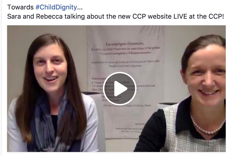
CCP Website Gets a Reboot

This summer we went live with a new platform for our website! As the new academic year begins, we have been putting the final touches on the code that keeps it together. Sara Boehk is the project leader behind this effort. Although she joins the CCP as research staff (a STDoc. candidate of the Gregorian), she received from her father, a senior systems analyst and application developer, a knack for code and an attention to detail that has helped take the website to the next level. Here are a few of the changes:
1. The CCP’s website has a new layout.
We’ve kept graphics and parallaxing at a minimum because we’re hoping that no matter where you live or what your internet connection is like you’ll be able access our site.
2. Our blog and our website are one.
They’re no longer separate sites. You can find both at iadc.unigre.it.
3. Our website is responsive.
No matter where you look at the CCP’s website, it’s easy to read. It scales to the size of your screen on every device.
4. You can sign up for our newsletter on the homepage.
We began publishing newsletters this past spring. If you sign up, in addition to our biannual newsletter, we’ll occasionally send you news about upcoming programs and events.
5. You can read the CCP’s latest tweets in the footer.
Don’t have a Twitter account? No problem. Look for the Twitter widget in the footer to catch our latest tweets. The CCP likes to [themify_icon icon="fa-twitter" link="https://twitter.com/CCP_Rome?lang=en"]. Thanks for the follow!
6. It’s easier for students to connect to the E-Learning platform.
This icon [themify_icon icon="fa-graduation-cap" link="https://learn.jc-hem.org/webapps/portal/execute/tabs/tabAction?tab_tab_group_id=_8_1"] is used generously throughout the site and will always lead back to class.
7. Our website is full of possibilities.
It’s brimming over with potential, and there’s room for your ideas too. What would you like to see on our website? Send your feedback and suggestions to

